A London house extension designed by Office S&M features a ceramic facade with the same pink glaze used for Tube station tiles on the Hammersmith and City Line.
Office S&M designed Beacon House, a single-storey rear extension, for a Victorian terraced house in Tottenham, north London.
It creates a larger kitchen and dining space for a couple and their two young children.
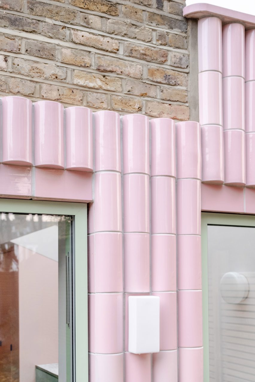
The architects chose “pillow-shaped” tiles for the extension’s facade, giving the structure a puffy aesthetic.
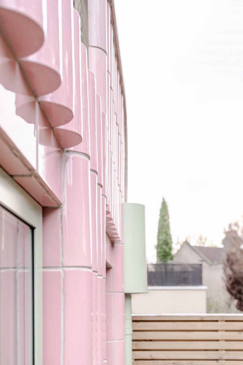
The bubblegum pink glaze is specifically used on Hammersmith and City Line station tiles, to match the colour that indicates the line on the London Underground map.
Here, it was selected to complement the original brickwork and reflect the clients’ love of municipal architecture.
“Alex and Ella showed us examples of public buildings they grew up with and ones they visited on their travels, which included sun-bleached climbing frames, tiled swimming pools, leisure centres and stations,” said Catrina Stewart, co-founder of Office S&M along with Hugh McEwen.
“Just like with these buildings, they wanted their home to be both robust and joyful,” Stewart told Dezeen.
The extruded clay tiles, handcrafted by manufacturers Materials Assemble and Teamwork Italy, contrast with the pale green colour of the window frames and downpipe.
“Ella grew up in west London and her dad used to take the Hammersmith and City line every day; the pink tiles reminded her of home,” added Stewart.
The renovation also involved improving the building’s performance, making it better insulated and ventilated, and bringing a contemporary feel to the interiors throughout.
The design features the bold colours and graphic style that have become Office S&M’s calling card, as previously seen in projects like Mo-tel House and Graphic House.
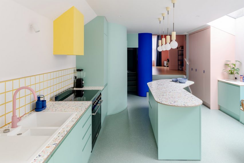
As with Graphic House, the interior features several bespoke elements that inject a sense of the owners’ personality. Stewart points to the kitchen island as an example.
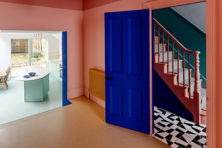
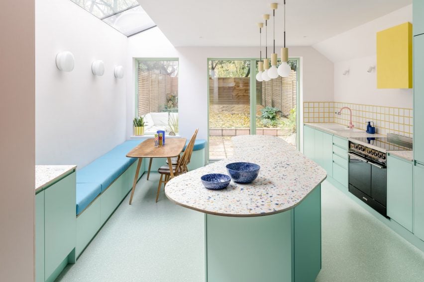
The central focus of the extension, it features a resin and timber worktop made by surface design studio Mirrl, using a technique inspired by Japanese lacquer craft Tsugaru Nuri.
“A bespoke pattern was created, referencing the clients’ memories of pastel hues and fading colours found along the British seaside,” Stewart said.
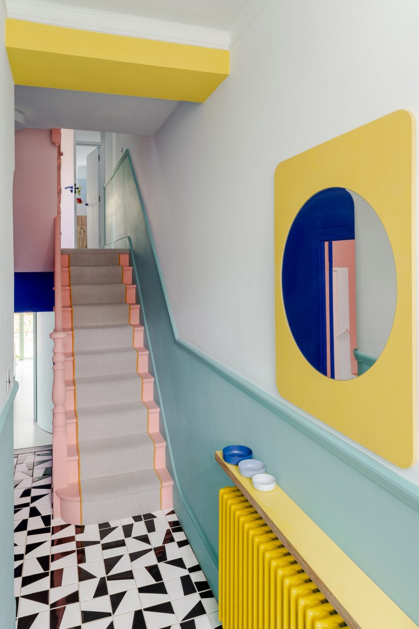
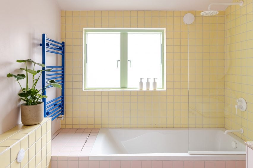
Tiled surfaces and curved details feature all over, continuing the aesthetic of the building’s exterior.
Examples of tiles include a yellow-grouted kitchen splashback, the monochrome flooring in the entrance hallway, and the soft yellow and pink surfaces in the first-floor bathroom.
Prominent curves include the kitchen island, as well as a rounded wall framing the downstairs toilet and a yellow-framed hallway mirror.
“Many of the municipal buildings that they showed us were associated with a story or a memory,” said Stewart.
“The subtle references in their home serve as a reminder of these stories and experiences.”
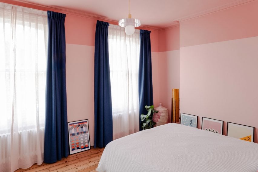
The colour scheme naturally progresses through the building, with richer tones at the front of the house and lighter tones as you move through to the top-lit extension.
Local craft makers were involved in many of the smaller details, from the baby blue banquette upholstery in the kitchen, to the hand-painted gold number fixed to the front door.
The photography is by French + Tye.
Project credits
Architect: Office S&M
Structural engineer: Foster Structures
Contractor: YG Builders
Furniture build: YG Builders
Kitchen surfaces: Mirrl
Glazed pink external tiles: Materials Assemble, Teamwork Italy
Global paints: YesColours
Upholstery: Studio Swade
Gold number sign: Mark Errington
