Dezeen School Shows: a house which takes cues from traditional Japanese houses is included in this school show by students at My ArchiSchool.
Also included is a veterinary centre for rehoming cats and a design for a high-rise building inspired by The Shard in London, UK.
Institution: My ArchiSchool
School: My ArchiSchool
Courses: Architectural Design Program 1.0
Tutors: Alice Cheung
School statement:
My Archischool and students started to experiment with a greater extent in sustainable design with wooden architecture, in order to reduce the carbon emission from concrete.
The studio provides an introduction to architectural education and digital design for those seeking knowledge and skills to aid their future career aspirations.
The Hong Kong-based organisation offers in-person and online courses to help young people develop 3D modelling skills that can be applied to future careers in architecture and urban planning.
Geared towards children and teenagers between the ages of six and 18, the various stages of tuition start at beginner level and progress to cover a range of tools, interfaces and outputs.
A variety of program packages are offered to those wishing to develop a wide range of skills over several sessions.
These include writing and portfolio development, while the most comprehensive package concludes with an exhibition of student work after eight months of study.
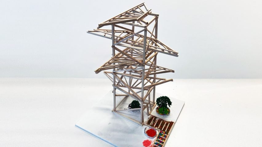
Student Hostel Design of suspension structure (wooden architecture) by Evan Sun
“Sun deployed a simple geometry of a wooden pyramid to serve as a structural core, with the extended ridge on top.
“He then hanged down the façade system from the high-level structure in order to reduce the numbers of connection points of the facade touching the ground.
“This will help the wooden structure to dry easily and to minimise the chance of being damaged by soaking in water.
“Inspired by the Shard in London, the design sees a high-rise with a similar geometry.”
Student: Evan Sun
Course: Architectural Design Program 1.0
Student Hostel Design with balconies (wooden architecture) by Sean Lee
“Lee designed this student hostel with a lot of irregular balconies for students, giving the illusion of shifting and making it an interesting place to live.
“Lee opted that the hostel itself should be a community but it should also be a place like home.
“The privacy of the individual should be highlighted, therefore, he made it with various triangular shapes without obvious alignments.”
Student: Sean Lee
Course: Architectural Design Program 1.0
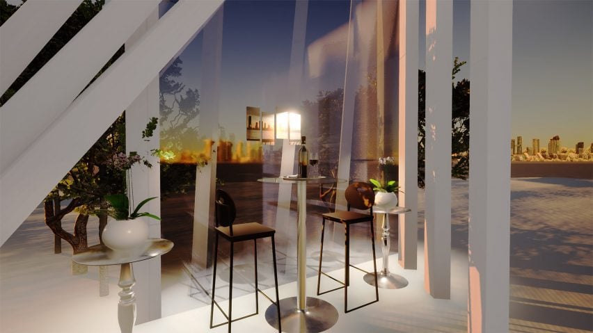
Hideaway Home design with friends zone by Sophia Xue
“Friendship is very important to Xue. When she designed a hideaway house project, she insisted to keep it with a friends zone.
“The users of this house can enjoy quiet moments and privacy, but these moment was not necessarily alone – just sitting down with a friend, looking out. This moment is called friendship.
“She adopted a low-rise wooden structure as if the house was a part of a forest.
“The natural lighting brightens the interior whilst the vertical slots of the wooden structure itself serves as a shading device to cut down the direct sunlight with heat.”
Student: Sophia Xue
Course: Architectural Design Program 1.0
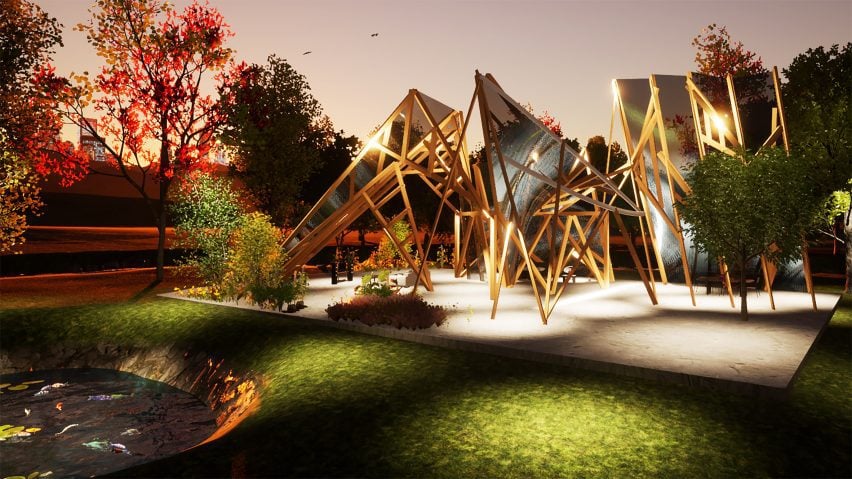
Hideaway Home design with a secret garden by Alanna Mak
“There is a secret pathway inside this house.
“It starts at the forecourt with the main entrance, then continues to the courtyard in the middle and ends at the secret garden at the back.
“She experimented with the possible new forms to be articulated with triangular wooden structures inspired by the traditional Japanese houses.
“The central courtyard provides natural ventilation and lighting sources for the whole house whilst the external faces of could be closed for privacy and security reasons.”
Student: Alanna Mak
Course: Architectural Design Program 1.0
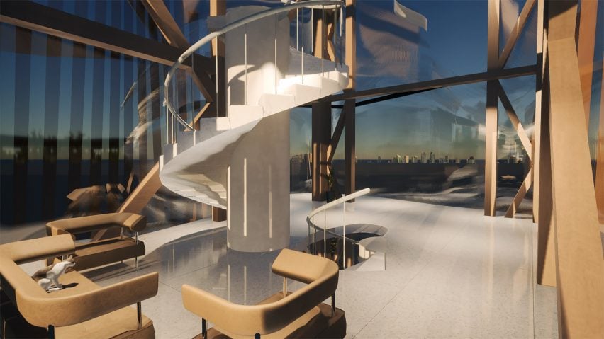
Cat clinic design inside wooden highrise building by Kyla Ho
“Ho loves cats – she keeps helping homeless cats to find their own shelters.
“She designed a home-like place for this cat clinic design.
“Starting with a wooden high-rise structural form study, she connects the waiting floors and the medical floors with an internal staircase for the users.
“She used large glass wall system supported by the wooden truss system to provide the natural lighting for the enjoyment of both cats and humans.
“With the external wooden shading design, the glare and the heat would be trimmed down for optimised comfort.”
Student: Kyla Ho
Course: Architectural Design Program 1.0
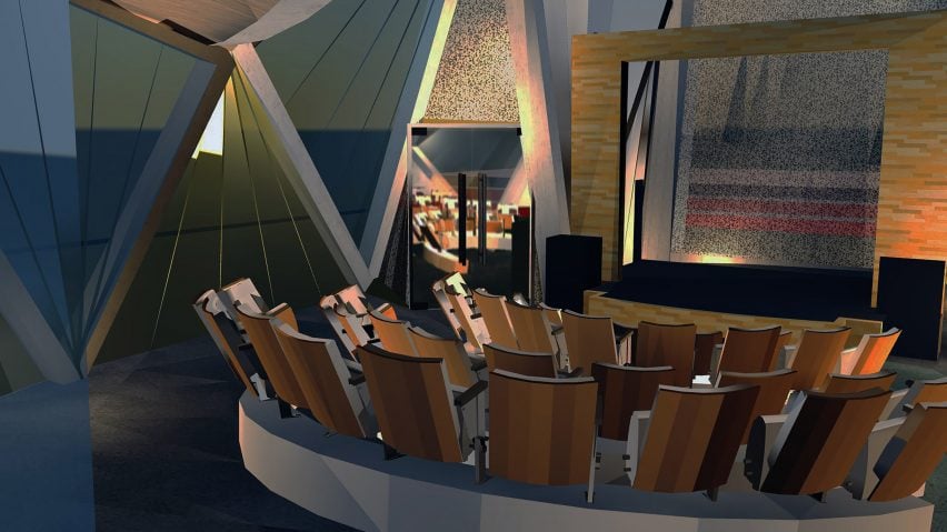
Hideaway House Design by Bernice Chan
“This striking architectural design features a futuristic, oval structure poised on a cliffside overlooking the ocean.
“The building’s hollow walls and curved roof blend harmoniously with the natural landscape, emphasising lightness and openness.
“It utilises a unique framework that appears to float above the ground, providing panoramic views of the sea and surrounding greenery.
“Inside, the layout is minimalistic yet inviting, with wooden flooring and cozy furnishings that encourage relaxation.
“This innovative design not only enhances the aesthetic appeal of its coastal setting but also promotes a seamless connection between indoor and outdoor environments.”
Student: Bernice Chan
Course: Architectural Design Program 1.0
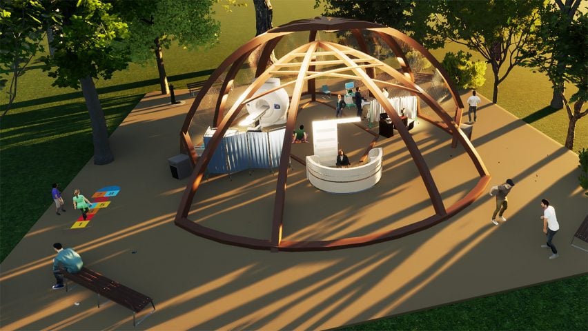
Cat Clinic Design by Chloe Ching
“Ching focused on designing a cosy atmosphere for animals, with the surrounding area outside of the building also designed to feel comfortable and safe, almost like a hug.
“This makes it feel like a safe haven, a sanctuary, creating a feeling of trust and security.
“This way, it draws more patients to the clinic and lessens panic among cats that are afraid of vets.
“Overall, besides the cat ear motif, her main goal was to provide a sense of comfort for both humans and animals alike at a place that is commonly associated with fear, dread and a lot of needles.”
Student: Chloe Ching
Course: Architectural Design Program 1.0
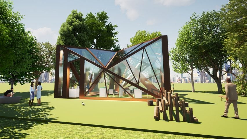
Cat Clinic Design by Nicole Ching
“In the age of developing diseases, there is a demand for humans to keep themselves and their cats safe.
“This cat clinic is designed with a reception area, cozy waiting area, indoor garden, cat playing area and most importantly, 2 medical sections – one for check-ups and the another for dangerous and contagious diseases, with separate entrances to decrease chances of cross contamination.
“The inspiration for this clinic was a cat’s head, which is demonstrated through the triangular shapes used throughout the building and the zig-zag window designs at the front of the clinic, representing the cat’s sharp teeth.”
Student: Nicole Ching
Course: Architectural Design Program 1.0
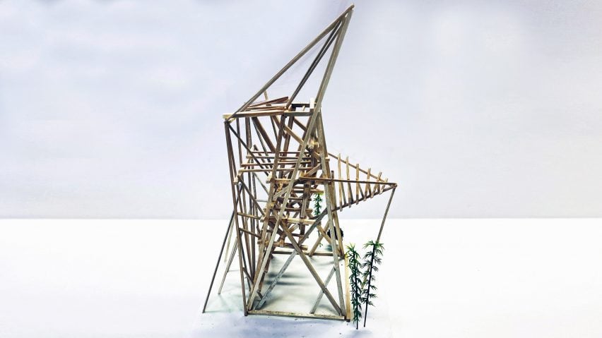
Student Hostel Design with double-skin façade (wooden architecture) by Albus Oscar Chung
“Inspired by the body shape of a gecko, Chung designs this student hostel with a sky garden for student users.
“When I lived in the hostels at Oxford for the summer programs, I found that I enjoyed being surrounded by gardens; the fragrance and colours inspired my hostel design with elevated gardens.
“The ground level in Hong Kong is overcrowded and it would be much easier to make it elevated.
“He made the cantilevered wooden structure to provide the elevated open space, whilst fabricating a double-skin façade on the other end to make it physically balanced.
“Besides, such façade system will provide a more durable waterproofing property for the whole wooden high-rise structure; the ‘multi-layering approach’ would possibly be one of the long-term solutions for wood to become a prime option for sustainability.”
Student: Albus Oscar Chung
Course: Architectural Design Program 1.0
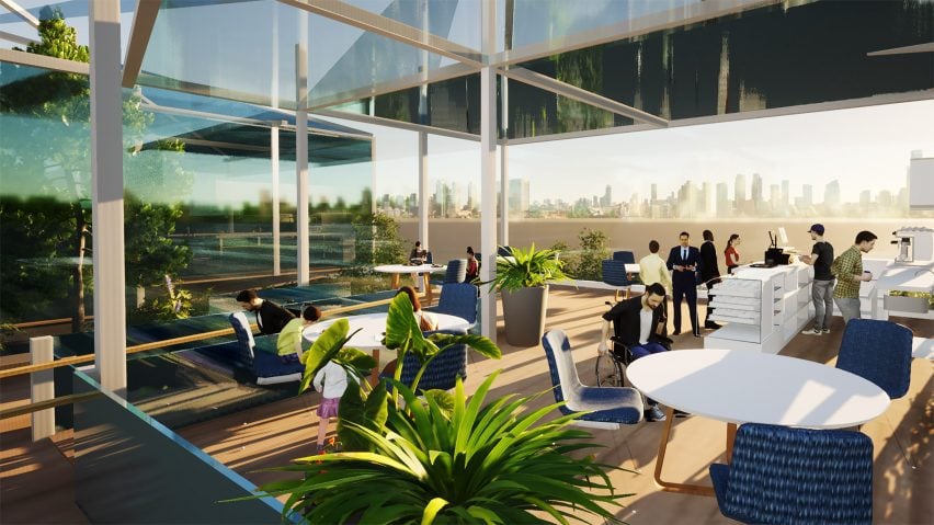
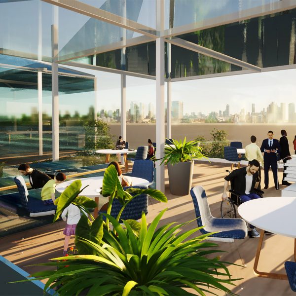
Café design with universal access by Nicole Tsoi
“My model of a cafe in Hong Kong provides a sense of inclusivity by featuring design elements which make the space user friendly for everyone.
“For instance, the ramp provides a route for the disabled and elderly who may find it difficult to travel a flight of stairs.
“The glass exterior provides customers with the view of local Hong Kong, allowing them to experience the robust culture that surrounds them.
“Additionally, this design combats sustainability issues like excessive carbon emissions by utilising natural lighting and making use of the natural shading from skyscrapers to avoid overheating.”
Student: Nicole Tsoi
Course: Architectural Design Program 1.0
Partnership content
This school show is a partnership between Dezeen and My ArchiSchool. Find out more about Dezeen partnership content here.

